


")
")


")
")


By now you guys should know that Android L is coming. And one of the things you want to get excited about Android L is that there is going to be a big design change for its interface. There were several other things about Android L that we could look forward to and I wrote about them in my previous articles. But the one that’s got me on the edge of my seat as we wait for its release is definitely the new Material design.
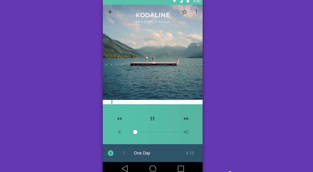
That is what we are going to talk about in this article. We gave you an overview of what Material design is, like the change of the 3 main buttons into more distinct shapes, as well as its emphasis on creating depth. But we are going to go even deeper to find out what other things Material Design is bringing to us consumers.
1. Enhanced transition animation
Let’s tackle this subject first since this is the most dynamic enhancement we would be seeing on Android L’s Material design. The first time you would see the transition you can already feel how much detail and work the developers put into maintaining the focus on the main subject. As you pick a specific picture or menu on your phone, instead of the usual fade or switching of the screen, you would see that the subject you tapped on will always maintain its visibility while the elements around it rearranges and fades out of view to be replaced by new elements.
2. Enhanced image loading
When picking an image from your gallery to be used as a profile picture for example. Material design automatically improves that specific image you picked by adjusting and enhancing the lighting and saturation of the picture, giving it a warmer look. The process to get from your gallery picture to the enhanced version is also well animated and makes you feel like the image is really going through the phases of beautification.
3. Well placed task buttons
Another thing you would notice right off the bat is that the menu buttons that have started to feel very corporate and stiff have been replaced by a small task circle that situated in an area of your interface that is aesthetically pleasing.
4. Focused depth
Lastly you would really see the depths and shadows coming into play in every interface Android L’s Material design. From animation to the positioning of application folders and picture elements, you will feel the emphasis of the Z-axis.
Android L is really looking good right now, and it has got me pumped up to see what other surprises they have in store for us.

")

